Patrick Sindler
Isaiah Wibowo
Vanessa Nguyen
Ryan Li
Wednesday, May 13, 2020
EXPERIMENT 2: FINAL SUBMISSION
THEORY
Varied verticality allows for more pedestrian movement,
linking two places together, and the Curve uncovers a graceful link to a
bridges surroundings.
FINAL COMMENTS
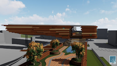
The bridge primarily spans between the Squarehouse and Tyree
building, with a short connection to the Roundhouse. Utilising varied
verticality, there are two links between the buildings – a more direct path on
top, with open green spaces, and a longer path that bypasses a lecture hall,
study spaces, a gallery, and the library. The bridge features natural curves, that
allow it to sit in its surroundings without being jarring, and the wooden
facades bolden the sense of linear pedestrian movement.
LINKS
Sketchup:https://drive.google.com/file/d/1BTcCDNT7yPh1xlwmgwb7KoVPJV0_YFJe/view?usp=sharing
Lumion: https://drive.google.com/file/d/1P6_XdqTeKienJm9GJLj5iJiJ21H-rZLZ/view?usp=sharing
NOTE: Final material choices are not in the sketchup model, as I find Lumion materials much more realistic and desirable. Please for to Lumion environment and final images for materials reference.
EXPERIMENT 2: MOVING ELEMENTS
The moving elements both allow for a larger sense of space. The receding wall allows for the space to continue in one linear movement, creating more common area when not in use. The rotating shutters allows for adjustment according to weather, letting in airflow as well as bathing the gallery in warm sunlight.
EXPERIMENT 2: PLAN MODIFICATION AND FIRST DRAFT
Taken from the collection of architectural, I have chosen this plan, India.
Instead of creating a section with this plan, I used its strong 'cross' design to inform my new plan. Another key design aspect that I carried over, are the bold staircases that interlock the two arms of the cross. However, my cross lies at an angle, and this asymmetry gives more variety in pedestrian movement and visual interest. The section shows how the arms do not necessarily lie on the same horizontal plane.
Instead of creating a section with this plan, I used its strong 'cross' design to inform my new plan. Another key design aspect that I carried over, are the bold staircases that interlock the two arms of the cross. However, my cross lies at an angle, and this asymmetry gives more variety in pedestrian movement and visual interest. The section shows how the arms do not necessarily lie on the same horizontal plane.
EXPERIMENT 2: BRIDGE PRECEDENT + THEORY
PRECEDENT BRIDGE
THEORY
Keywords:
Location: Hernani, Spain
Year: 2015
Collaborators: Julen Rozas, Aitor Ortiz
Clients: Ayuntamiento de Hernani
Surface: 350m2
Status: completed
Purpose: Connect the old and new worlds of Hernani, Spain
THEORY
Keywords:
Graceful
Linking
Vertical
Curve
Varied verticality allows for more pedestrian movement,
linking two places together, and the Curve uncovers a graceful link to a
bridges surroundings.
Sources:
Subscribe to:
Comments (Atom)


